Starting on a new User Interface design project can be daunting. You just received a hundred pages worth of specifications which may include: project, creative design and build briefs; draft wireframes and app flows ideas; deliver abilities requirements; examples of existing products; and brand guidelines that you have to navigate around.
So where do you start?
(Updated Sep 2022)
Getting the Budget Right
Even getting to this point can hours of your time - speaking to the client, researching, and waiting for all the necessary puzzle pieces to fall into place - before you have everything you need to be able to evaluate the project and submit an accurate quote.
First off - how do you know how much and how to charge for something so comprehensive and vast as a big user interface design and a style guide production project?
I find that an hourly rate approach works well here. Some clients are happy to pay whatever the amount of time you spent on the task but generally, they want an overall quote from you before they give you the green light.
My approach? Once I have all I need, I go through everything one item at a time considering how much time I would need in the best and worst case scenarios to do that task. Don't forget to include money transfer and currency conversion rate fees if applicable.
Adding everything up provides me with a required budget range which I can discuss with a client. If the client is happy with your work as it progresses and the feedback is minimal, then you'll be working towards a lower number - or vice a versa.
You also need to take deadlines and availability into account, and you'll need to create a payment plan.
I tend to split the project payment plan into four phases:
- Research, ideas, and sketching.
- Wireframes and workflows design.
- UI/UX design and polish.
- UI guide document design.
You've Got the Go Ahead
You've secured a great contract. Now you're sitting in front of a blank page... where do you start?
Plan Ahead
Putting together a simple contents page including all the agreed design items will create a visual reference for where you are and what still needs doing. This will also break a comprehensive document into more manageable parts for your client and developers. Sure, it will be revised many times as you progress through the project, but at least you've got some manageable milestones to approach and achieve one at a time.
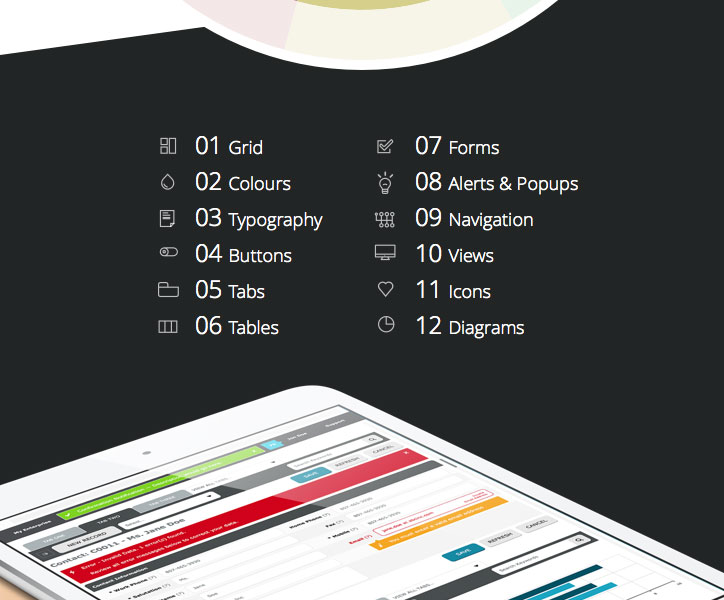
Start With the Basics
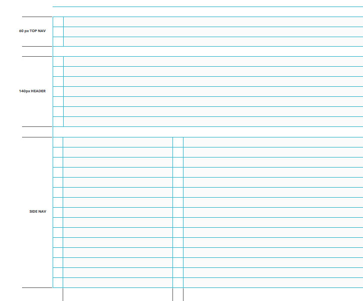
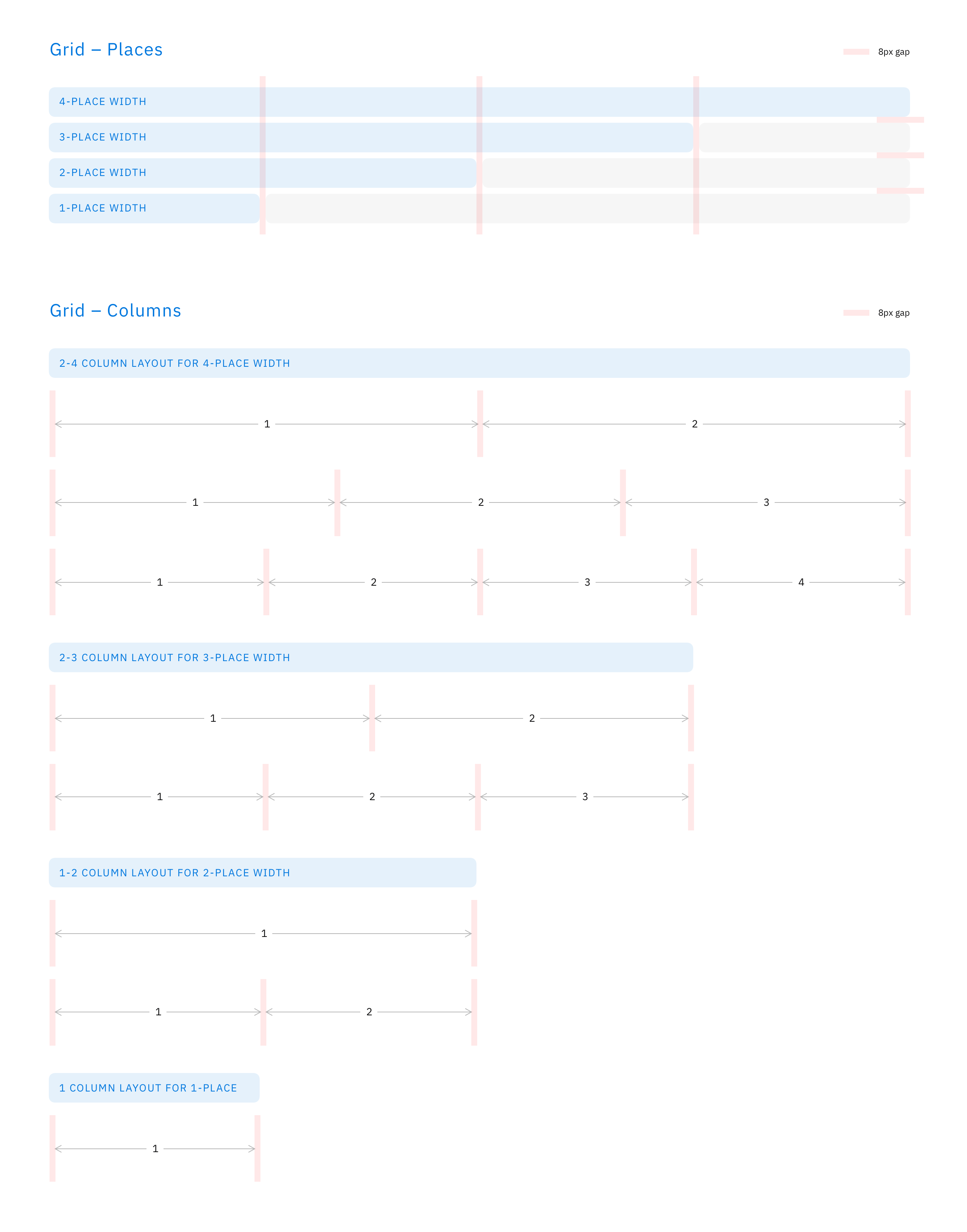
Setting up a grid and sticking with it will help you keep visual consistency across all the UI elements. The key factor to keep in mind is that it needs to be versatile enough to be scalable. Otherwise you might have to come back to it by the end of the project and revise it, which, in turn, will cause you to update the UI slightly. (Let's face it, it will happen, so budget for it as well.) It also needs to work within all the carefully considered constrains of the project.
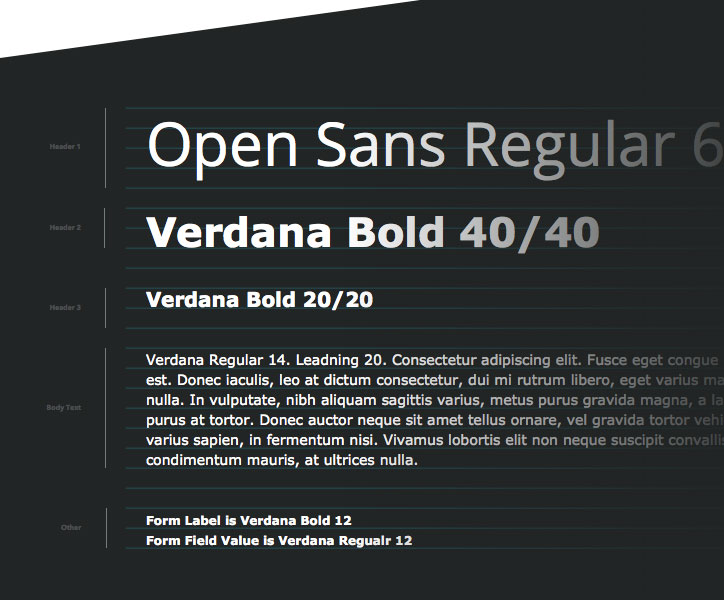
Same goes for the typography baseline grid.
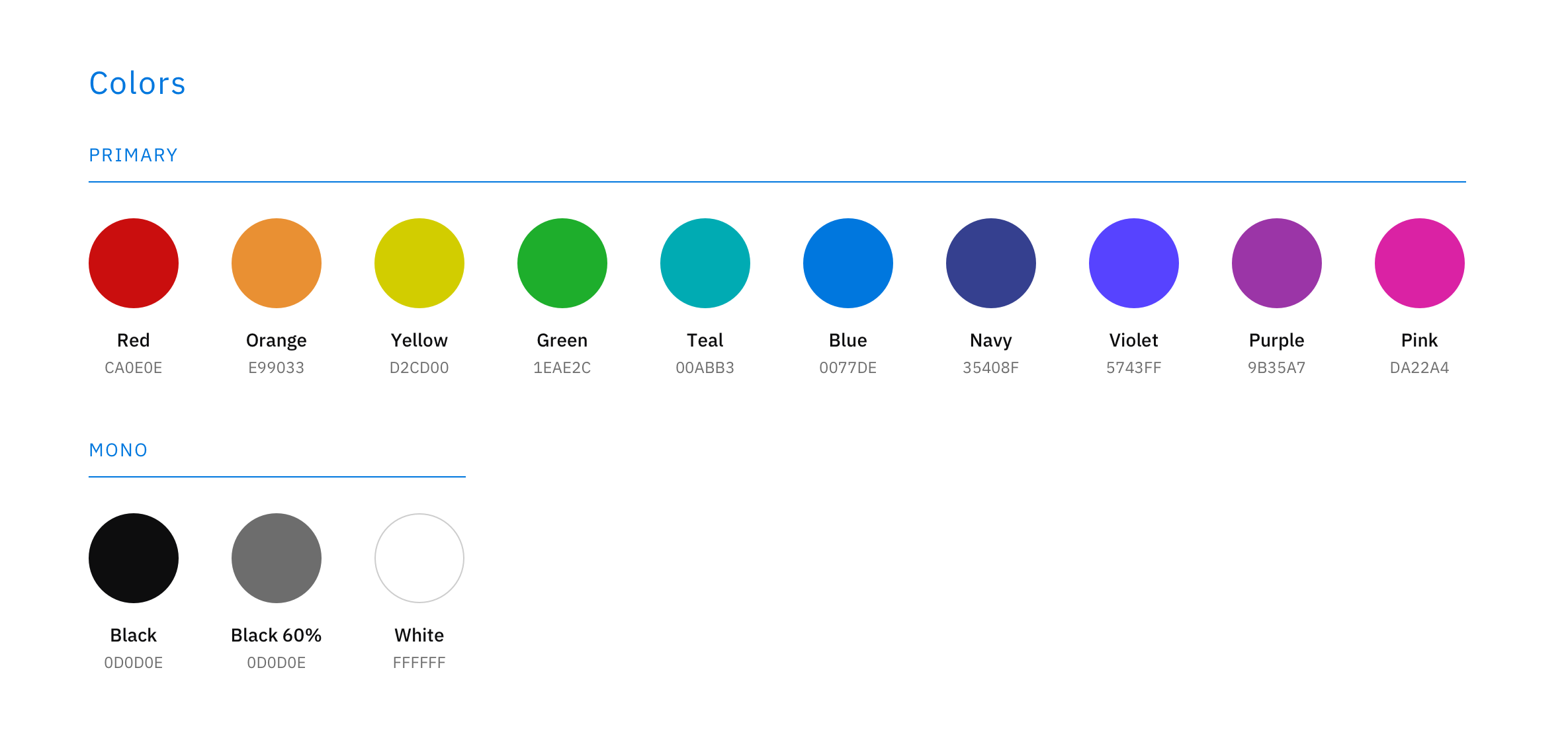
I find that putting together an initial and approximate colour palette based on the design brief can speed the process up dramatically. To start with, it usually contains many more colours than I'll need eventually and includes about 10-15 shades of blues or greys to ensure I have enough contrasting colours for the user interface to do what it needs to.
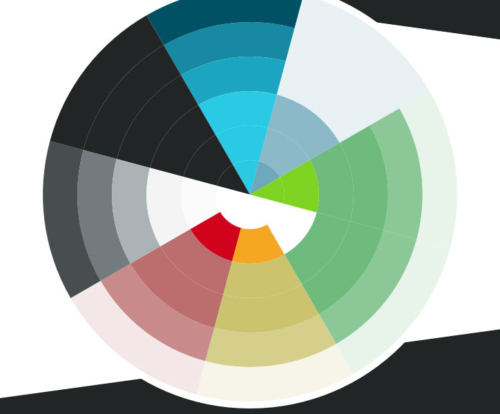
You can download the above colour wheel as a freebie from my previous article.
Continue With the Essentials
By this point you should have enough to feel like you're in your groove and everything flows nicely. All you have to do is go through your plan one point at a time, creating all the elements, revising as you go, until you and your client are happy.
Test, Update, and Revise
Once all the elements are in place and all the necessary screens are put together, it is important to ensure the intended user flow and experience will work. Which means you'll need to test it and revise it, a lot.
You can read my other article, Sketch & InVision Apps Workflow Tips for the UI/UX Design Process (coming soon!), on how to accelerate this final stage of your design process with the mighty Sketch and InVision Apps
At the end of the UI design phase, just as I'm starting to put together the UI guide document, I revise the colour palette and all the necessary UI elements to ensure I have the minimal possible amount of colours and styles, which will require a slight revision of the visuals.
Conclusion
Hopefully, by the end of the project, my user interface design does not only solve my client's problem within all the constrains of the brief but can also be described using my all-important keywords:
- Clear
- Concise
- Familiar
- Consistent
- Attractive
- Efficient
Please feel free to leave any comments and/or questions below.
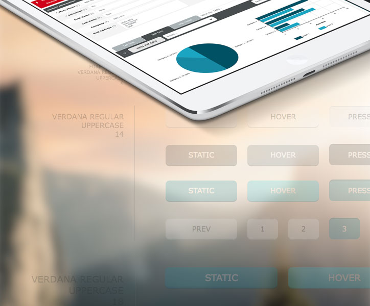
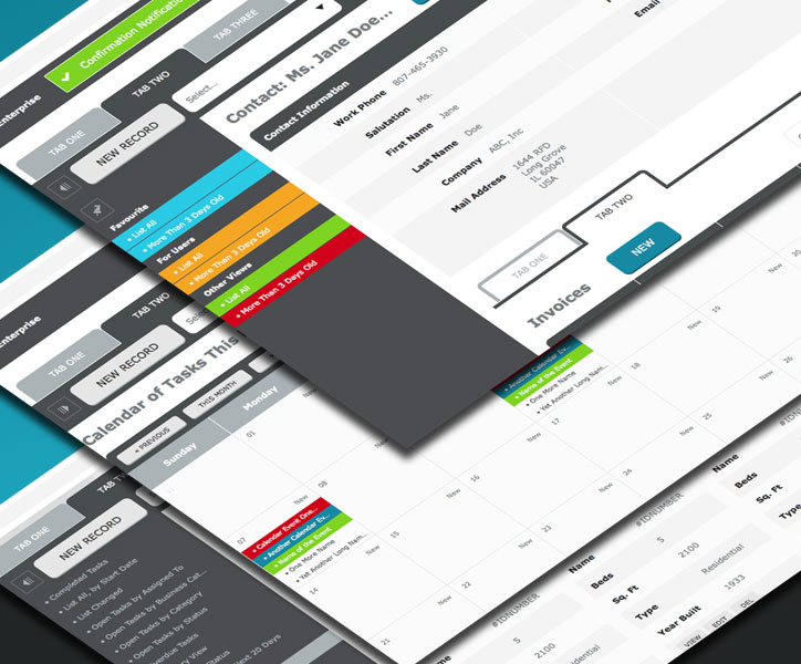
Screenshots used are from the recent TeamDesk UI design project, which you can check out in full on Behance. A 2022 UI refresh is now being developed.
2022 Update
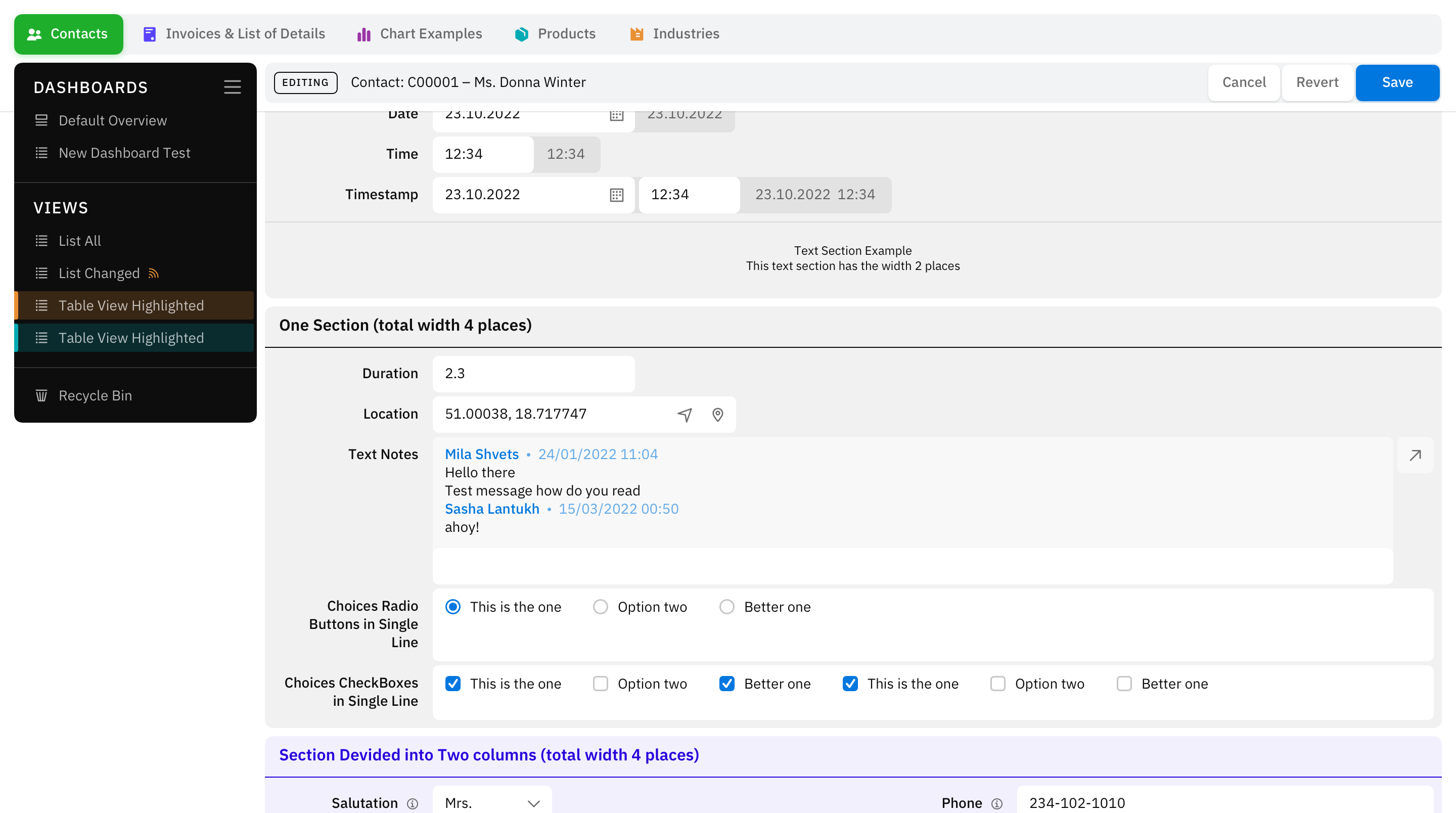
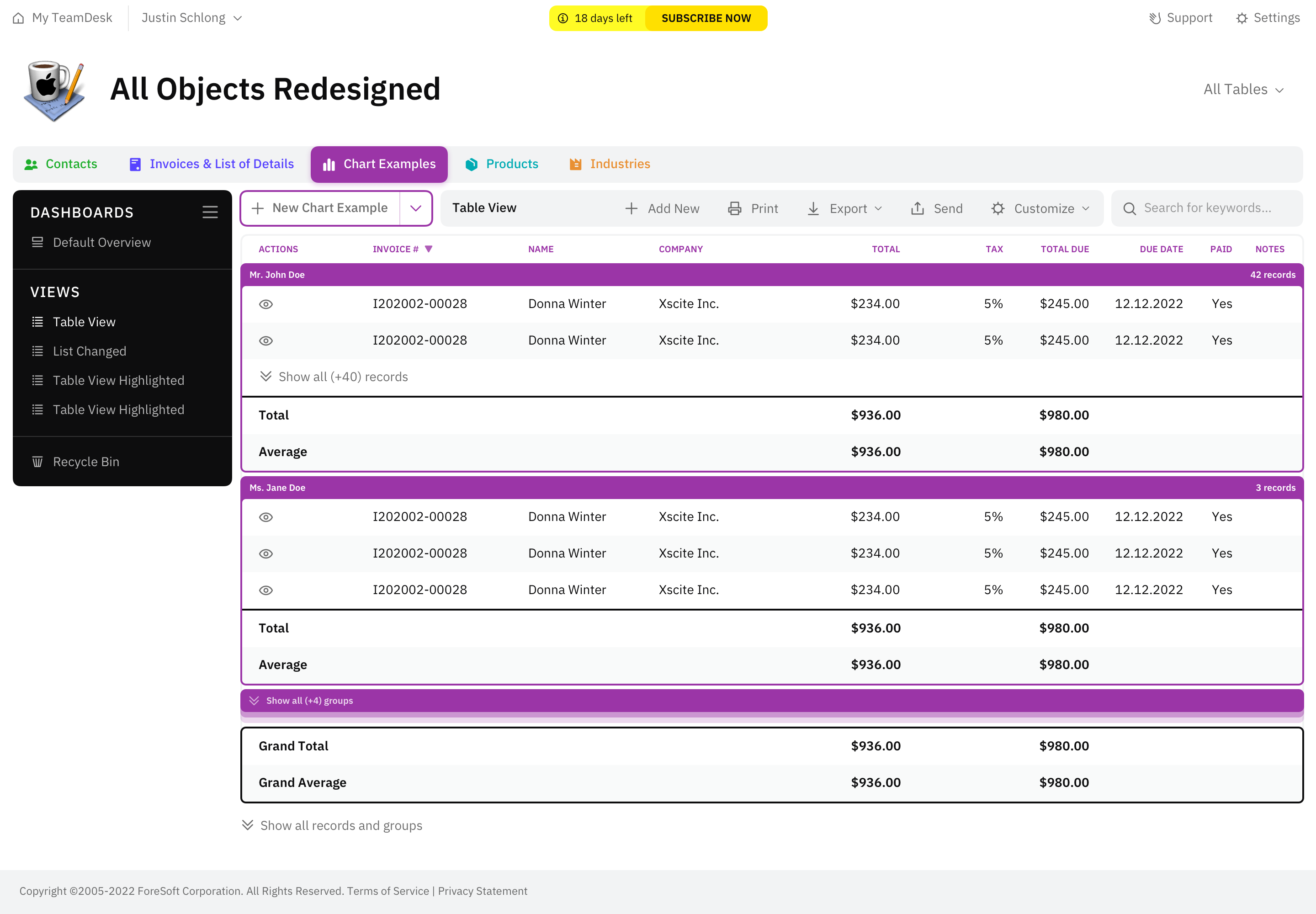
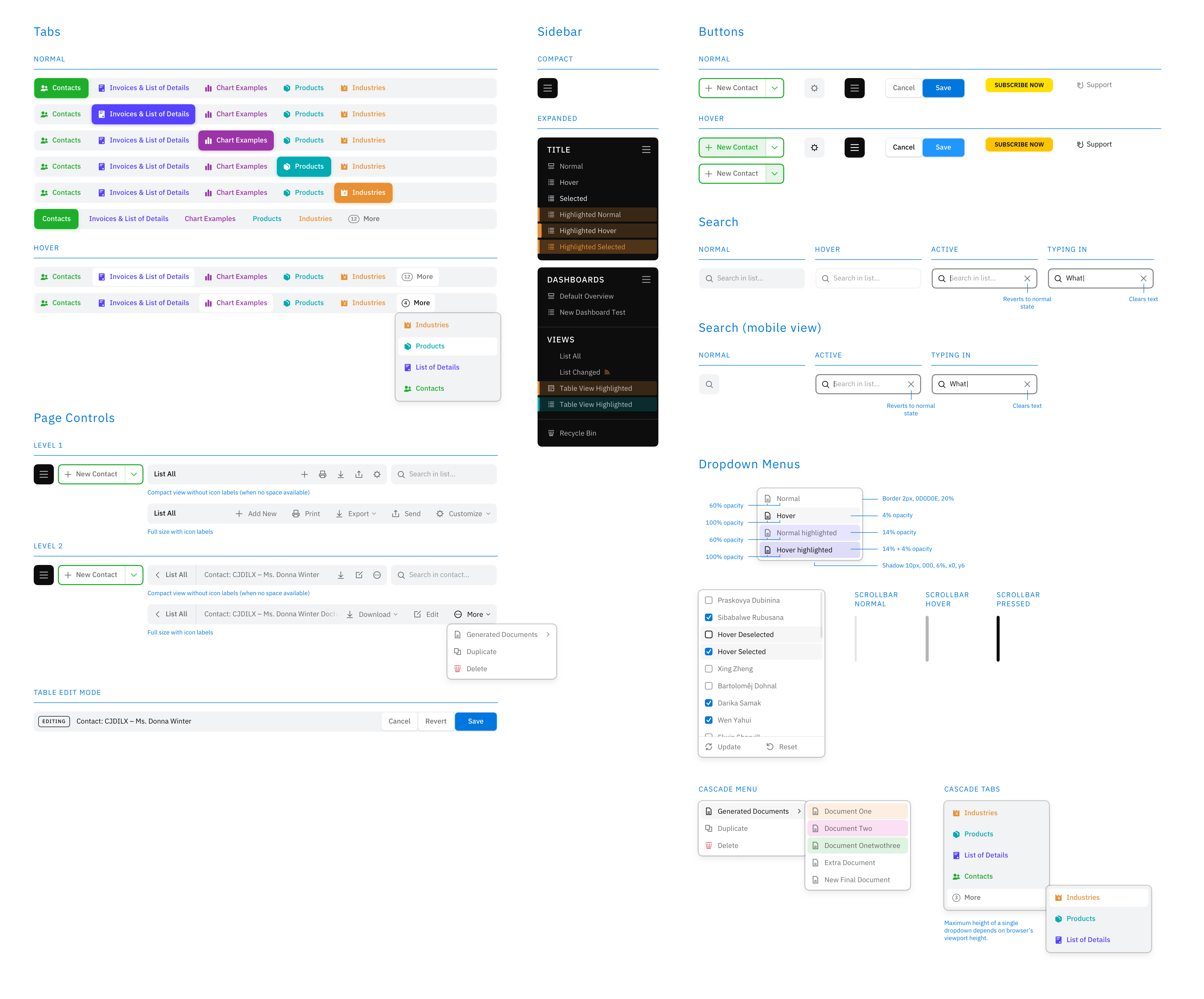
Eight years later our team has designed a second version of the TeamDesk UI web application. You can see a few screenshots below. A full case study for this project coming shortly! This project completed as part of the Studio SS partnership.

 London /