The Design That Never Was will be an ongoing series of blog articles dedicated to the part of the work that was completed for a project, but for various reasons never saw the light of day (until now, that is). Whether another option was chosen by a client, someone changed their mind, or decided to go in a different direction, here will be a place where tribute can be paid to the designs which were prematurely put to rest.
MedAct New Website Redesign
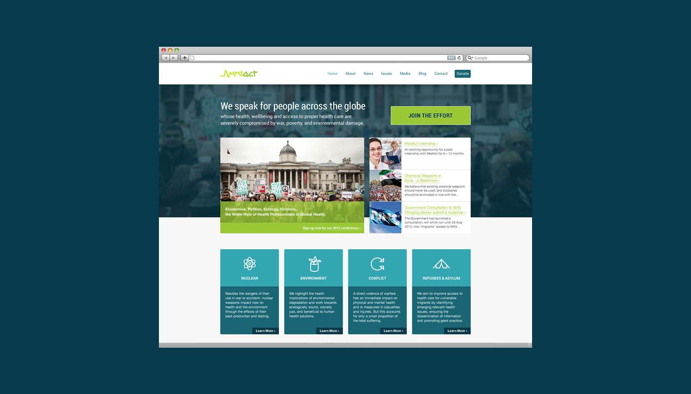
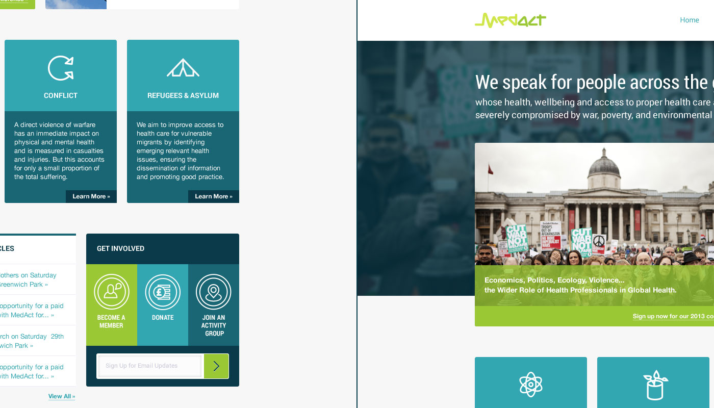
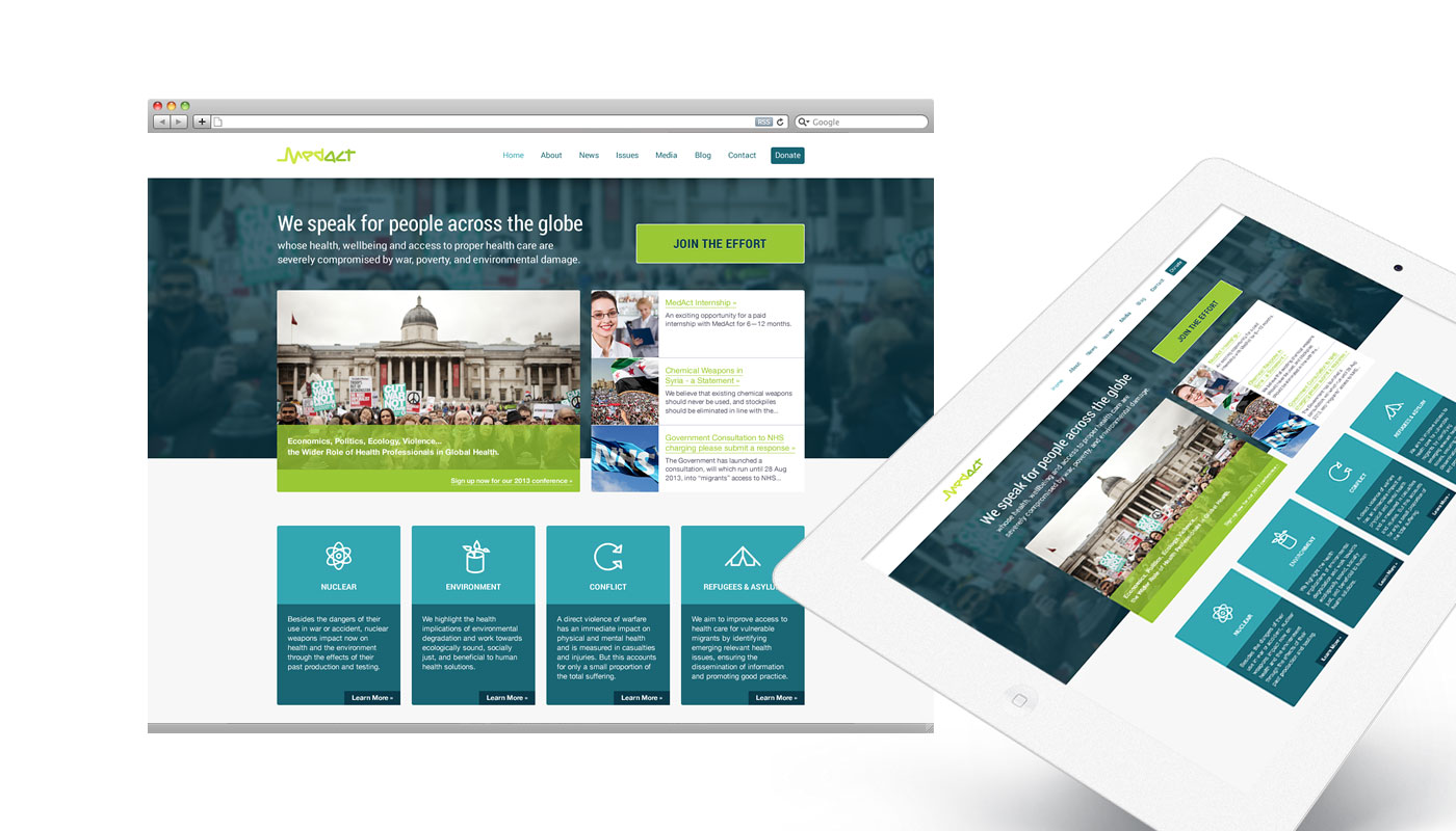
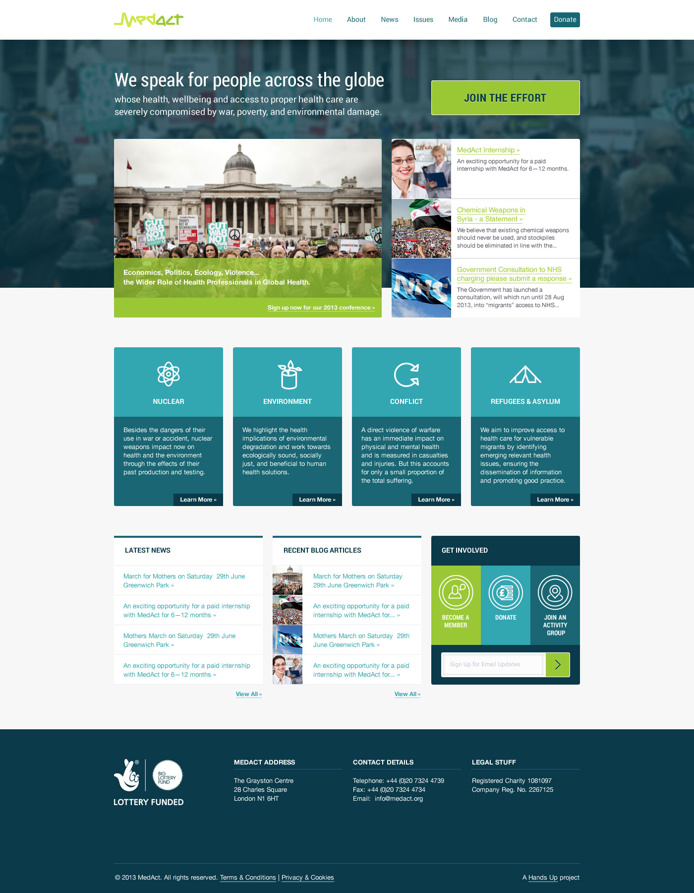
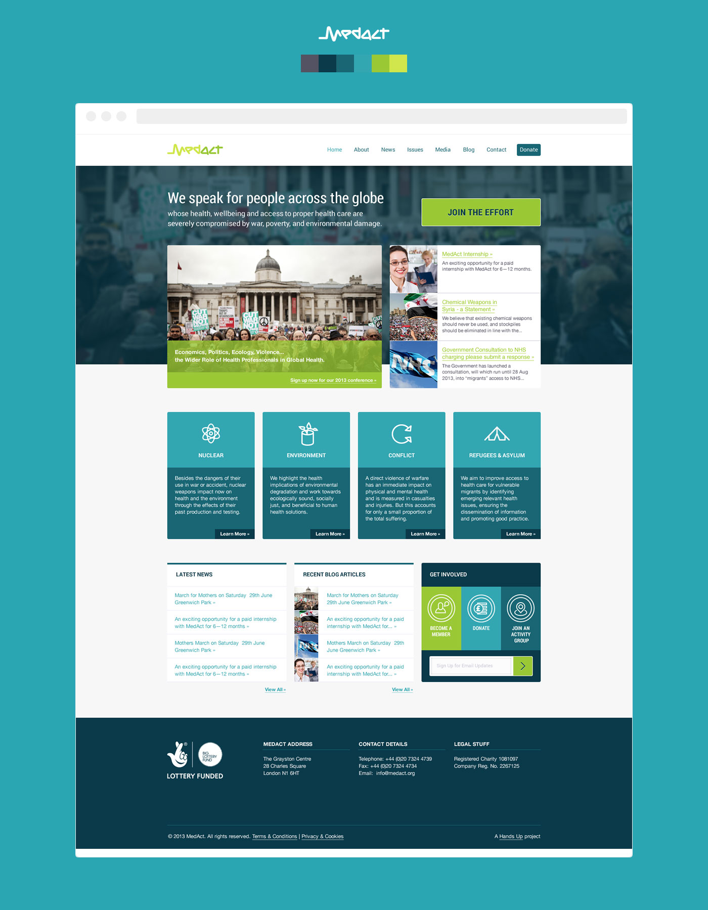
The very first one of these is a second option visual of a homepage for MedAct guys who speak out for countless people across the globe whose health, wellbeing, and access to proper health care are severely compromised by the effects of war, poverty, and environmental damage.
I haven't seen the option that was chosen yet as the website is currently under construction. But once the new website is live, it will be fun to compare and learn from it... which is the idea behind this exercise. Please have a look through and feel free to leave any comments below.
The Brief
The idea behind the redesign was to disassociate from the emotive feel of an aid organisation and instead opt for a scientific, professional feel that is outspoken and bold without being loud.
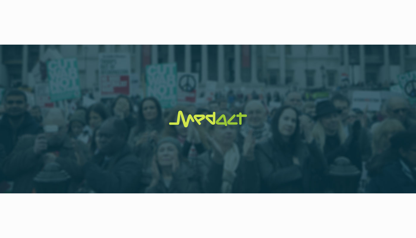
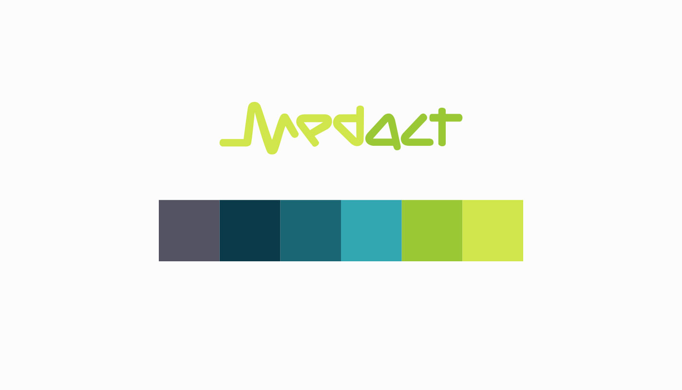
The logo needed to stay the same, but I was encouraged to create a different colour palette, with the general website colours being entirely up for grabs.
The New Colour Palette
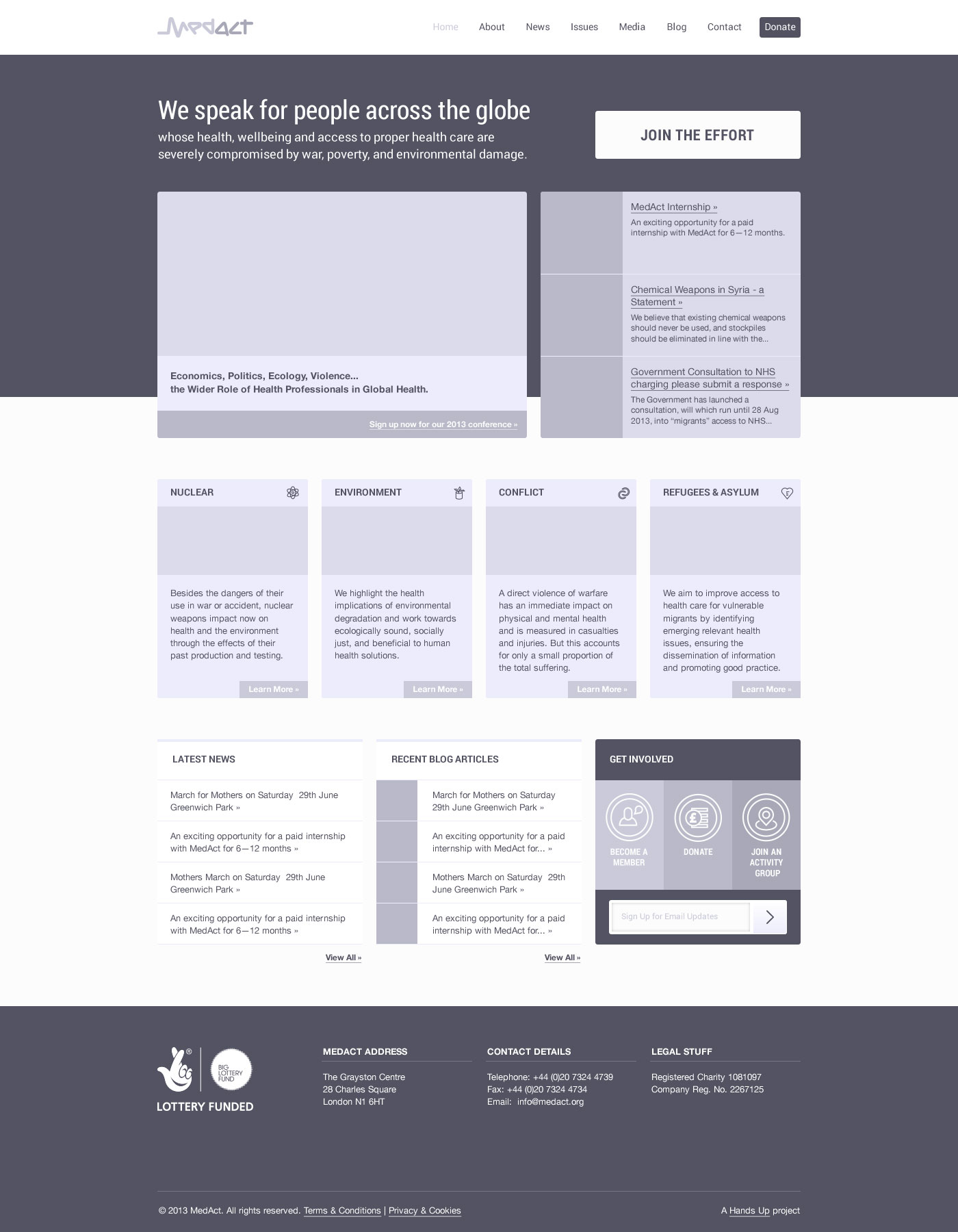
Detailed "Wireframe" Approach
This time I decided to try out a new approach for me — a so called detailed wireframe — which I thought had some benefits, and which I'll talk about further below.
I was provided with a roughly sketched normal type wireframe to work from. Usually, my process would commence with generating a general look and feel using the chosen font family and a colour palette from the header to the footer.
This time, however, I went only as far as finding the right font family, and chose not to worry about colours and images until the visual is "ready", detailing everything in pure contrasts first.
Detailed Wireframe Approach Benefits
This took a while to get used to as I had to keep reminding myself not to think about colour combinations and images. Instead, the process was all about visual contrast, priorities, and space. Once that was done I could move on to the next stage and apply the chosen colour palette and images.
Working this way was a bit faster as I only focused on one aspect of the design at a time.
If you've been working with this kind of approach for a long time, tried it once, or never worked this way, feel free to chip in to the discussion.
The Design
Some Credits
This homepage was a design for some lovely people from HandsUp.
Amazing icons used were designed Luboš Volkov.

 London /